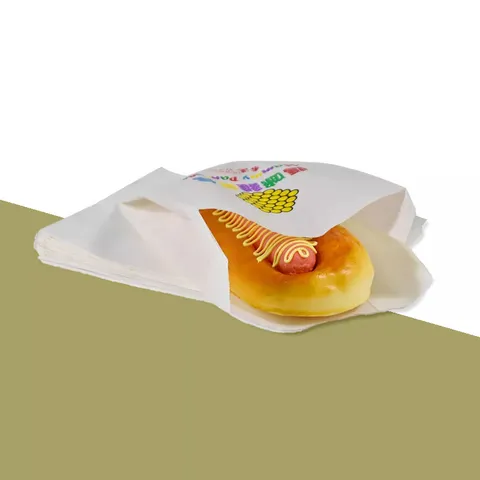
What inks go onto greaseproof paper?
Greaseproof is printed with food-safe soy and water-based inks. They soak into the top of the fibre rather than drying as a skin on the surface, which is why a printed sheet folds around a hot bap without the colour cracking at the crease.
Each colour on the sheet is one ink, mixed to a Pantone solid-coated reference. There is no four-colour process build, so a deep green stays the same green from the first sheet of the run to the last. Runs go from one colour up to four.
Once dry the ink has almost no smell. Open a fresh carton and you get paper, not solvent, which matters when the sheet is pressed against a warm bun or a slice of cake for an hour.
From your file to a finished sheet
The route from artwork to carton is the same for a chip shop and a cake maker. Only the sizes and colours change.
- You send the logo as a vector file and tell us the sheet size, stock and colours on the quote form.
- We lay the artwork onto the sheet, as a single logo or a repeat pattern, and send a free design proof.
- You check position, scale and colour and ask for edits; there is no limit on rounds.
- On approval a plate is made for each colour, and the ink is mixed to the Pantone you chose.
- The press runs the sheets, which are then cut to size, counted into reams and packed in cartons.
- Production takes 4 to 6 working days after proof approval, and delivery to a UK mainland address is free and tracked.
Nothing prints before you have signed off a proof. If the sheet that arrives does not match the approved proof, report it within 10 days with photos and it is reprinted or refunded.
Kraft or white: how the base sheet changes your colour
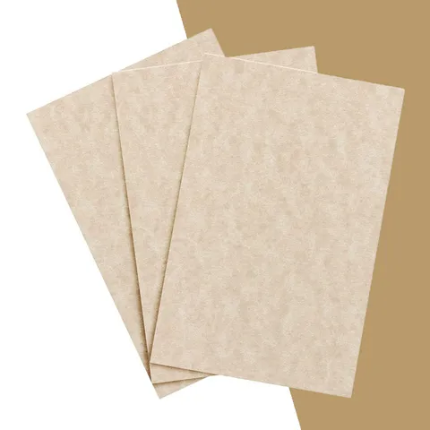
Greaseproof comes as a bright white stock or a natural brown kraft. On white, the ink shows the Pantone you picked. On kraft, every colour is laid over brown, and the brown shows through.
The effect is strongest on light and bright colours. A pale yellow sinks almost out of sight, a sky blue turns teal, a bright red goes brick. Black, dark navy, deep green and burgundy sit comfortably on kraft and look like they were meant to be there.
Our opinion, for what it is worth: print one colour on kraft. Two colours on kraft tend to look muddy unless both are dark. Save the three and four colour designs for white stock, where each colour has room to be itself.
Why does my Pantone look different on kraft greaseproof?
Pantone solid-coated references are specified on a smooth white coated card. Greaseproof is neither smooth nor coated, and kraft is not white, so some shift is unavoidable. On white greaseproof the match is close; on kraft the stock does the shifting.
There is also a small gain. The paper absorbs a little ink, so each stroke spreads by a fraction and a fine line ends up a touch heavier than on screen. Designers call it dot gain, and it is why hairline rules and tiny text are best avoided.
If an exact brand colour matters, say so on the quote. We can advise which Pantone on kraft lands closest to the colour you want on white, and the proof lets you compare the two stocks before anything is plated. The printed greaseproof sheets on kraft or white page shows both stocks.
One logo or a step-and-repeat pattern?
A single logo is placed once, usually centred or set to one corner so it shows after the wrap is folded. It suits a liner or a tray sheet where the whole face is on view. On a wrap, a single logo can end up on the underside and never be seen.
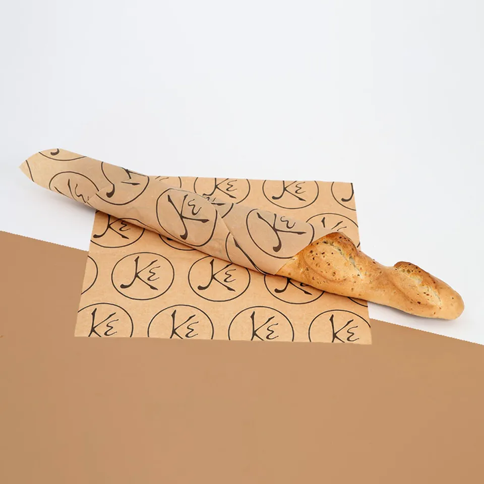
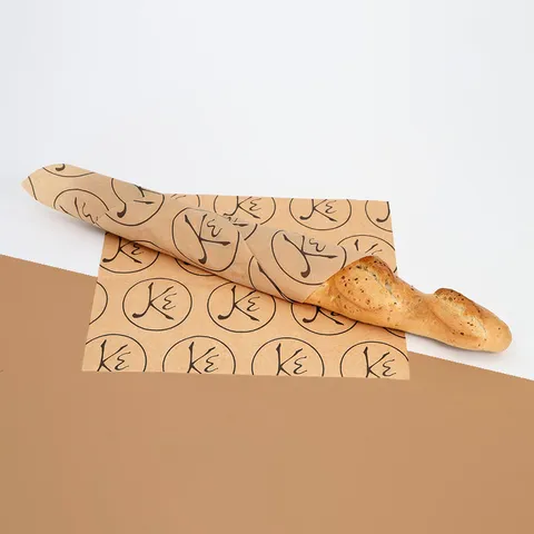
A step-and-repeat pattern tiles the logo across the sheet at a set spacing. However the wrap is folded, part of the pattern faces up. It also hides small print flaws, disguises show-through on light stock and makes the counter look busy in a good way.
Repeats are measured in millimetres between logos. Around 60 to 90 mm suits a 300 × 300 mm burger wrap; a 450 × 700 mm chip shop sheet can take a larger logo on a wider spacing. For a fancier counter a textured greaseproof stock with print gives the pattern a bit of grain behind it.
Setting up a file that prints cleanly
Most proof rounds are spent fixing files that were never built for a press. These settings save a round or two.
- Send a vector file (PDF, AI, EPS or SVG) with all text converted to outlines. A JPEG or PNG screenshot of a logo will not plate cleanly.
- Keep every line at 0.25 mm or thicker, and every letter at 6 pt or larger, so dot gain does not close it up.
- Build the file in spot colours named by Pantone number, one per ink, with no gradients, tints below 15% or drop shadows.
- Keep artwork at least 10 mm in from the cut edge; sheets are cut from a larger web and the edge can wander by a millimetre or two.
- If the logo has a white element, remember that white is the paper, not an ink. On kraft that element prints brown.
- Send the file at the finished sheet size, or at the repeat size if you are supplying the tile yourself.
If you only have a logo as a flat image, say so. A simple mark can often be redrawn as a vector for you before the proof, and that is covered by the free design proof.
How many colours do you really need?
Every extra colour means another plate, another ink mix and another pass on the press, and the quote reflects that. The table shows what each count buys you on the counter.
| Colours | What it looks like | Best stock | Typical use |
|---|
| One | A single solid mark, strong and clear | Kraft or white | Chip shop sheets, burger wraps, bakery liners |
|---|
| Two | Logo plus an accent line or background tint | White, or two dark inks on kraft | Deli counters, cafés, sandwich shops |
|---|
| Three | Full brand palette with room for a tagline | White | Street food brands, burger chains with a set palette |
|---|
| Four | Everything the brand guide allows | White | Promotional wraps, seasonal runs, Valentine's and Easter specials |
|---|
Most of the sheets leaving us are one colour on kraft or two colours on white. Three and four colour runs look great, but they are the exception, not the rule.
What happens at proof stage?
The proof is a PDF of the sheet at scale, with the logo placed, the repeat spacing shown and the stock colour simulated behind it. It also lists the Pantone references, the sheet size in millimetres and the gsm, so everything you are approving is on one page.
Check three things in particular: that the logo is the right way up relative to how you fold, that the repeat does not cut a logo awkwardly at the edge, and that the Pantone numbers match your brand guide. Zoom to 100% and look at the thinnest line.
Edits are unlimited and no plate is made until you approve. If you are in a hurry, the fastest route through is to send a clean vector file first time, because the 4 to 6 working day production clock only starts at approval.
Mistakes we see on chip shop and café artwork
A few errors come up on nearly every first order, and all of them are easy to avoid once you know to look.
The first is a logo built for a website: full colour, gradients, a glow effect, white text on a dark rectangle. On paper that becomes a four-colour job with a solid block of ink that fights the fold. Ask your designer for the one-colour version of the mark; most brands have one.
The second is a logo too small for the sheet. At 40 mm wide a mark is a stamp, not a brand. On a 300 mm wrap a logo of 70 to 90 mm reads from across the counter.
The third is approving the proof on a phone screen. The simulated kraft looks lighter on a bright screen than the real stock does under shop lights. Open it on a laptop, or ask for a stock sample with the quote. The Design Your Greaseproof Paper studio lets you place the logo on a sheet and see the spacing before you send anything.
From approval to the shelf behind the counter
Once the proof is approved the job is plated, printed, cut and packed in 4 to 6 working days. Cartons are tracked to any UK mainland address in 2 to 3 working days at no charge, so a first order is usually on the shelf inside a fortnight.
The minimum run is 1,000 sheets or one roll, which is a sensible first order for a single counter. Reorders use the same plates, so there is no proof round to repeat unless you change the artwork.
Payment is by invoice after the quote and the proof are both approved. The exact price depends on size, weight, stock, colours and quantity, and it comes back in writing within one working day of your request for a printed paper quote.